Wow that was one of the quickest terms I’ve had. It seems like it was last week we had a last assessment for MPI104 and I had to tick some little boxes to see if I had done everything required for assessment #1. Over the semester I have learnt a lot of handy tricks such as posting a link to websites. I believe these links gives the page some authenticity, as the readers are able to click on the key word and like magic there at a new page. In the olden days I would have just copied and pasted the web address, this was tacky. Therefore to sum up so far learning all about HTML have been fun and worthwhile and I’m sure there is more to learn about them.
So I will start on my blog. I have tried to update it as often as possible but I found this difficult as like many uni student these days, the end of a semester is extremely busy but I feel I am pleased with the quantity of blogs I have published. Okay so no I’ll get into the nitty gritty of my blog. Okay I have played with the template and style a bit. I was going to put a Sydney Swans background as my template but discovered the colour scheme would not be appropriate and make my blog difficult to read. I also decided I did not want pictures in the background as I was looking at other blogs in the class and felt that the blogs with picture detracted the words in a sense. Therefore I decided on a different approach to give my blog a fresh new look. I found a colour wheel and a page on colour schemes on the net. Very useful. Researching colour schemes I was able to get an understanding of the appropriate colours to use for my template. I had a green template and felt using dark purple, blue and a light blue on occasions was the correct colour scheme I was after. I was talking about the colour wheel for a reason because I was able to choose a specific colour and shade I was after to insert in my blog, as I felt the colour options that blogger offered were pretty standard, and simply I wanted more. To spice my blogs up I tried to insert pictures as often as possible to give readers a visual understanding of what I was writing about. Too much text can be boring. The blog I’m most happy with it Making my page look top. On some blogs I even went as far as placing a video on it so the readers are able to see in greater depth what I have writing about. The Departed.
Okay that’s enough about my blog, Flickr was one of my greatest challenges as I felt I didn’t have enough adequate picture to upload to my account. I found I had severe technical issues when uploading some of my images. Some photos were did not upload correctly, …… and a picture in picture effect was created. For some reason Flickr decided to import a smaller version of the image in the top left corner. I tried to fix this in many ways and spent hours on getting one full image uploaded, as I just wanted the image to look normal. I found this only occurred on specific photos. The photos I tried to import were originally from the internet and maybe there was a copyright over them, but they were only my friends my space photo and I know she didn’t copyright them. Anyway so I decided to keep the photos there to highlight my difficulties with uploading but others photos couldn’t even upload for apparently the format was incorrect even though I triple checked the format and it was all correct. What was going on? I tried to upload these images but my computer just wouldn’t accept them. I decided to try another computer, a better one and finally I was able to upload snapshots of aesthetically pleasing website. Was I relieved or what. I found that the technorati top 100 sites didn’t interest me and I felt that the ones I checked out weren’t aesthetically pleasing so I moved on to band webpag+es as I know they always have funky sites. For the assessment I was required to upload 30+ images and I decided to turn to my past and upload images of me when I was young. It was fun to do this as I was able to track down memory lane for a bit as I remember my first day of school, skiing, when I got my cats. I shared these photos with everyone so they too will be reminded of their past and hopefully have a little smile on their face ☺. Organising my flickr was pretty easy in the end I created 3 sets, swans game, family and friends and miscellaneous. These sets enabled me to navigate my way through my photos effectively as too the tags.
My Del.ici.ous was hard to get into, by that I mean I couldn’t really get excited about the site. Generally I use my little laptop and save all my bookmarks under safari. However saving bookmarks under Safari only enables me to access the bookmarks whereas Del.ici.ious allows me to share my bookmarks and discover new sites for myself. For example I found an awesome game for an equally as awesome television show, Robin Hood. Not only could I access new sites I would have never found I was also able to send sites to people so they could check the sites out that I found interesting. Really I should learn to appreciate Del.ici.ious more. Bundling my bookmarks makes finding relevant bookmarks much more easier, I don’t really want to go through pages and pages of bookmarks to find something that may interest me. This is why I love those bundles. The internet is all about making research accessible and Del.ici.ious follows through with this belief by the wonder of bundling and tags.
So now you know what happened this semester and what I have created online. I’ve had some good times and I will continue to uses these pages and skills well after MPI104 ceases in the coming weeks for me.
Wednesday, 13 June 2007
Counter
Last term I put a basic counter on my blog that only told me how many people had accessed my blog. This was all the information it had and when Jo gave us a different counter option I jumped at the option. A counter is not only good to have 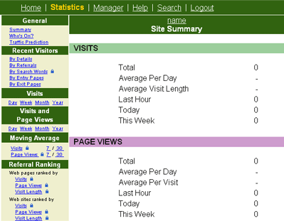 to boost your ego as you always try to compete with your friends about who has the most hits, similar to technorati, but you can also see what you can improve on your site. So recently I decided to use Sitemeter as a counter system. Since I only joined recently Sitemeter hasn’t been able to get a steady recording about my visitors, but when I was checking out other peoples sitemeter, (what can I say I was curious) I discover it can give more detailed than I first imagined. You can conclude many things from the Sitemeer figures:
a) If they hit your site but do not stay it is either poor in content or form and is not worth staying more than two minutes for. Therefore you need improve on both these two to increase the likelihood of visitors staying on your blog.
b) If you have no recent hits in the past week you can get an idea on your content may be out of date and visitors don’t find anything relevant. Therefore updating your page, or in my case my blog, is important to get constant hits.
I have noticed other sites have only had visitors say very quickly, under 2 minutes. That could be depressing but I suppose many people are browsing the internet and search until something of interest capture their eye. This is one of the reasons the aesthetics of the website is so integral. Before I joined Sitemeter I did have a 123 visitors to my blog which I was pleased with but the counter did not offer me nearly as much information as the lovely Site meter.
to boost your ego as you always try to compete with your friends about who has the most hits, similar to technorati, but you can also see what you can improve on your site. So recently I decided to use Sitemeter as a counter system. Since I only joined recently Sitemeter hasn’t been able to get a steady recording about my visitors, but when I was checking out other peoples sitemeter, (what can I say I was curious) I discover it can give more detailed than I first imagined. You can conclude many things from the Sitemeer figures:a) If they hit your site but do not stay it is either poor in content or form and is not worth staying more than two minutes for. Therefore you need improve on both these two to increase the likelihood of visitors staying on your blog.
b) If you have no recent hits in the past week you can get an idea on your content may be out of date and visitors don’t find anything relevant. Therefore updating your page, or in my case my blog, is important to get constant hits.
I have noticed other sites have only had visitors say very quickly, under 2 minutes. That could be depressing but I suppose many people are browsing the internet and search until something of interest capture their eye. This is one of the reasons the aesthetics of the website is so integral. Before I joined Sitemeter I did have a 123 visitors to my blog which I was pleased with but the counter did not offer me nearly as much information as the lovely Site meter.
Tuesday, 12 June 2007
Making a Templates - was it successful?
Recently I have been playing with my blog template. Initially I wanted to design one so I created a Sydney Swans template with the greatest player as the feature, who else but Tadhg Kennelly. For those of you who don’t know Tadhg he is an Irish man who plays for the swans, he is a backman that is one of the most important players for the swans. I defy anyone who thinks differently. Click here to see my template. Anyone I created a template when watching television one night. It was easy enough to do in front of the box. So I began by importing photos in to photoshop, the swans logo, Tadhg and any other swans photos that I wanted. So I had made my page but struggled to place it as my template. I then realized I had done things incorrectly so I couldn’t use it as a new template. This was a good thing as if I’m honest it wouldn’t have been aesthetically pleasing and legible with a background with red and white. For example what colour scheme will I use to write my blogs in, black is an obvious choice, but did I want to use black? Any way I had fun designing it, which is the most important thing, right? And I refreshed myself with photoshop which I haven’t played with for awhile. My efforts weren’t completely useless with a bit of refining I know have an awesome desktop picture. However lets not think I haven’t altered my templates I found some changed the colour scheme a bit and changes the setup of the blog. It was good to change my blog again so I can look at it again and not feel as though I’ve seen it before, hopefully it will have the same effect on others. I can check this out on my sitemeter.
Saturday, 9 June 2007
A Little Bit of Live
A Little Bit of Live is a hot new show coming to CSU soon. That's right its going to be an hour and a half of gold. It’s on the June 19th, so its coming up. Everyone should go to the Tav to watch this great show. My role on the night is Sound assistance. To be honest it has been hard, as I had to learn the whole desk. It is a big  desk with millions of buttons and functions. My sound supervisor was Pierre and together we are both coming to terms with the capabilities of the desk. One of the hardest part of sound is recording the band, mainly the drum kit, and getting quality sound to air. On the night I know I will be nervous as, as we can’t afford to make any mistakes and therefore I hope all our practice sessions will have kicked in by that stage. However I have more roles than just sound assistance for ‘A Little Bit of Live’. I have directed 2 pre-recorded segments, and edited 3 others. I feel that the 5 segments I have been involved with have turned out really well, especially the ones I edited as the camera shots we excellent and the director was really easy to work with. So they are the roles I have done for the live show, yeah I know it doesn’t really relate to MPI104 but its what I’ve been doing at uni for the past couple of weeks as a lot of my time has been consumes with ‘A Little Bit of Live’. I tell you what I can’t wait for the wrap party on Tuesday night.
desk with millions of buttons and functions. My sound supervisor was Pierre and together we are both coming to terms with the capabilities of the desk. One of the hardest part of sound is recording the band, mainly the drum kit, and getting quality sound to air. On the night I know I will be nervous as, as we can’t afford to make any mistakes and therefore I hope all our practice sessions will have kicked in by that stage. However I have more roles than just sound assistance for ‘A Little Bit of Live’. I have directed 2 pre-recorded segments, and edited 3 others. I feel that the 5 segments I have been involved with have turned out really well, especially the ones I edited as the camera shots we excellent and the director was really easy to work with. So they are the roles I have done for the live show, yeah I know it doesn’t really relate to MPI104 but its what I’ve been doing at uni for the past couple of weeks as a lot of my time has been consumes with ‘A Little Bit of Live’. I tell you what I can’t wait for the wrap party on Tuesday night.
Friday, 1 June 2007
Making my page look tops
To make my blog aestheically pleasing I needed to ensure the colours matched, for example the page was legible and the colours were co-ordinated. I decided I should research first and not trust my eyes, as my colour co-ordination may be not as good as I thought. So I was off to research to make my blog look great. I found a good website, a HTML colour code generator that enables me to match the colour scheme on my webpage. Pretty awesome. I could easily find out what colours match with one another, such as pink, blue, red or green, with one slide of my cursor. Yep all I had to do was slide the cursor on the primary colour generater and this smart little website gave me matching colours that I could use for my web page. After I found this website I was determined to find another. My belief was if I found a good site so easily surely there would be more out with even more information, and sure enough there was. Colour matching for web design had more functions on it. There was a colour wheel that gave me pretty much unlimited choice of colours, but I found it didn’t really help me in my cause just highlighted how many  colours I had to choose from to make my page stand above the rest. Then I found a great link, an article on colour combination. This link gave me the meaning of colours, what they signified and most importantly for me what effect they had on screen. For those too lazy to go to the link I give you a brief overview of some of the colours. Check them out.
 RED - Red tends to promote images and text, making objects appear larger and closer, though less than yellow coloured objects. Bright red can be annoying if used over large areas and is useful as a iconic colour to encourage people to act quickly eg. on buy or click here buttons. An apetite stimulant, red is useful for promoting products associated with energy ... drinks, cars, sports and games.
 ORANGE - Orange backgrounds help images seem closer and larger, but avoid over use.Useful for highlighting important elements, promoting food products and toys.
 BROWN - Brown is too low key if used broadly without texture or another color to enhance it. Useful for promoting food and outdoor products for work and play.
 YELLOW - Yellow stimulates mental activity, generates muscle energy and attracts attention - it is the colour most visible to the human eye. Thus yellow objects move to the forefront. Cheerful yellow can be used to promote food especially in combination with other fruit and vegetable tones, children's and leisure products and is best used as a highlight. With overuse, yellow can be disturbing and promote anxiety.
 GREEN - Images set in green backgrounds seem farther away.
 BLUE - Blue does not require the eye to focus, images and objects recede in blue backgrounds. However an overuse can create feelings of cold. Although also popular with women, blue is the predominant favourite colour of males and is suited to web sites involving and promoting technology, medical products, cleanliness, air, sky, water, sea and automotives. Blue is the favourite colour of more than half of the world's people - it is the colour least disliked by most cultures. High impact designs can be created with combinations of blue, red and yellow. Combinations of light and dark blues can create feelings of trust.
 BLACK - Black is an excellent technical colour and it assist targeting a sophisticated high-end market or a youth market to add mystery. Over a large area, black can be depressing. Though black backgrounds can enhance perspective and depth, they diminish legibilty of text. Useful for web sites for art and photography to help other colours to vibrate.
 WHITE - All white rooms can be uncomfortable with a stark atmosphere. White is useful for a background or accent colour as it highlights other colours. White is perceived by the eye as a brilliant colour.
colours I had to choose from to make my page stand above the rest. Then I found a great link, an article on colour combination. This link gave me the meaning of colours, what they signified and most importantly for me what effect they had on screen. For those too lazy to go to the link I give you a brief overview of some of the colours. Check them out. RED - Red tends to promote images and text, making objects appear larger and closer, though less than yellow coloured objects. Bright red can be annoying if used over large areas and is useful as a iconic colour to encourage people to act quickly eg. on buy or click here buttons. An apetite stimulant, red is useful for promoting products associated with energy ... drinks, cars, sports and games.
 ORANGE - Orange backgrounds help images seem closer and larger, but avoid over use.Useful for highlighting important elements, promoting food products and toys.
 BROWN - Brown is too low key if used broadly without texture or another color to enhance it. Useful for promoting food and outdoor products for work and play.
 YELLOW - Yellow stimulates mental activity, generates muscle energy and attracts attention - it is the colour most visible to the human eye. Thus yellow objects move to the forefront. Cheerful yellow can be used to promote food especially in combination with other fruit and vegetable tones, children's and leisure products and is best used as a highlight. With overuse, yellow can be disturbing and promote anxiety.
  GREEN - Images set in green backgrounds seem farther away.
 BLUE - Blue does not require the eye to focus, images and objects recede in blue backgrounds. However an overuse can create feelings of cold. Although also popular with women, blue is the predominant favourite colour of males and is suited to web sites involving and promoting technology, medical products, cleanliness, air, sky, water, sea and automotives. Blue is the favourite colour of more than half of the world's people - it is the colour least disliked by most cultures. High impact designs can be created with combinations of blue, red and yellow. Combinations of light and dark blues can create feelings of trust.
 BLACK - Black is an excellent technical colour and it assist targeting a sophisticated high-end market or a youth market to add mystery. Over a large area, black can be depressing. Though black backgrounds can enhance perspective and depth, they diminish legibilty of text. Useful for web sites for art and photography to help other colours to vibrate.
 WHITE - All white rooms can be uncomfortable with a stark atmosphere. White is useful for a background or accent colour as it highlights other colours. White is perceived by the eye as a brilliant colour.
Monday, 28 May 2007
Those pesky fire alarms
Argh does any one else have those fire alarms that tend to go off at a drop of a hat. Today the alarms went off twice and both times there was no smoke in the air. What is going on? To makes matters worse when one decides to go crazy the others kick in, and there are 5 in the house, one in everybody’s room. I know that fire alarms are necessary and save lives and are one of the best things invented, but after all these false alarms what are we going to do when there is a real fire? Just sit in our room and hope the alarm stops when fire and smoke fill the house, then we get burnt to death. I know this sounds like a morbid post and I sound cynical about these but after awhile of these loud ear-piercing alarms screaming just above your ear it does get tiring. What was ironic was that we had security come round last night to check if our alarms were functioning and I think its been proven over the last couple of days as they have been going off at the drop of a hat. So in came security and set them off and we had to listen to the chilling sound once again for no smoke again. Even though I have ranted about these pesky fire alarms I am grateful we have them because our stove and oven is gas tops and I know how easily fires can start because I have put my spaghetti on fire as it has dipped into the burning flame. Wait don’t all flames burn? Yeah so my spaghetti was on fire and the fire alarms went off, so they did there job. And by the way in case your wondering, no I did not burn the house down I doused in just in time.
Friday, 25 May 2007
Technorati
When I first signed up to Technorati a couple of months ago I had no idea what this was.  However upon research I have discovered it is not only a search engine for other peoples blogs, which many believe is similar to google in other aspects but Technorati offer much more. Technorati is capable of allowing the user to save favourites blogs and to get an update of your favourite blog entries. Technorati is a good ego booster if you have a high ranking and it is fun to compete with friends over your rank and authority. My authority is 9, this means that my blog has been linked 9 times by other people. My rank is pretty good and I have one of the highest out of my friends, 565 314. The rank is a measurement of your blog popularity, with 1 being the highest 565 314 seems far away but in comparison to the rest of the class its pretty close to the elusive number 1.
However upon research I have discovered it is not only a search engine for other peoples blogs, which many believe is similar to google in other aspects but Technorati offer much more. Technorati is capable of allowing the user to save favourites blogs and to get an update of your favourite blog entries. Technorati is a good ego booster if you have a high ranking and it is fun to compete with friends over your rank and authority. My authority is 9, this means that my blog has been linked 9 times by other people. My rank is pretty good and I have one of the highest out of my friends, 565 314. The rank is a measurement of your blog popularity, with 1 being the highest 565 314 seems far away but in comparison to the rest of the class its pretty close to the elusive number 1.
Subscribe to:
Posts (Atom)